SCC Flyer Design
Front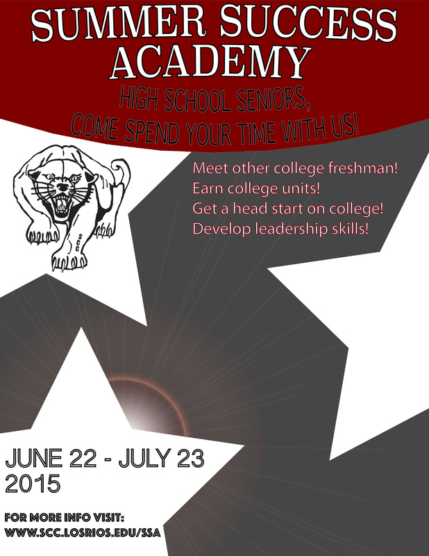
|
Back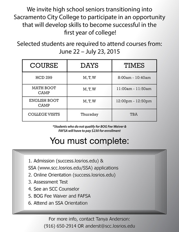
|
The target audience for this project is high school seniors who are planning to enter college (preferably at SCC) next year. I tried to keep my design simple but still attention-grabbing and visually appealing to a viewer. I used dull colors in the backgrounds so that the SCC red would stick out a bit more on the page. I also used stroke on my text so that the text did not look weird against the background color it was on, especially if the background changed throughout the length of the text. On the front of the flyer, I also used the "Z" design concept which I have learned is a technique advertisers use to attract viewers' eyes. Ms. Anderson was very helpful by giving very specific feedback. Her first piece of feedback focused on my use of color and the use of space. She specifically stated that she liked that it was not crowded, which is why I focused on doing a simple design in the first place. I often see flyers and other advertisements that are over-crowded and it instantly turns me off to whatever it is (with rare exceptions). Ms. Anderson's next piece of feedback was that I should change the stroke color on some of the text on the front. This piece of feedback also prompted me to add stroke to some text on the back page that was blending in with the background too much. I liked my design because it was simple and I didn't end up having to use a cheesy stock photo. I also really liked how the gradient background of the back page eneded up. I managed to not blend anything into it. One thing that could have been improved was using some more creative fonts. I feel that this would add a bit of flare to the flyer without taking away from the simplicity of the design.
Album COver

|
For this assignment, my task was to design and create an album cover for a potential release. Part of my assignment was to use a paint-like version of a photo of myself using smart filters in Photoshop. One of my interests other than music is astronomy, therefore Mr. Means had the idea to use an image from the Hubble's free gallery in my design. I used the photo as the background and integrated it into the image of myself. During this project, I learned how to make gradient masks, specifically over text. Gradient masks are when one lays a gradient pattern over one specific object, as opposed to an entire layer. One thing I would like people to notice is that the Album is titled "Master of Ceremonies," but it is not planned to include vocals.
|
